

CLIENT
DAVE SCHOOL
MY ROLE
MARKETING DIRECTION
BRAND MANAGEMENT
CREATIVE DIRECTION
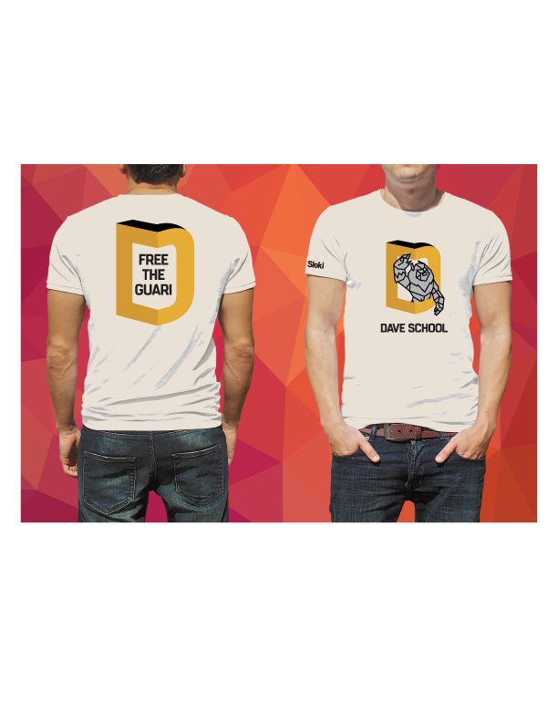
GRAPHIC DESIGN
CONTENT CREATION
LANDING PAGES
EMAIL
SOCIAL
SUMMARY
I led design on the
re-branding and website refresh

PROBLEM STATEMENT
Starting in 2013 the visual effects and animation school market for post secondary students nearly quadrupled. So one of the longest running schools in the industry came to me to help rebrand their school and redesign their website to help them stand out in the newly saturated computer graphics school landscape.


SETTING DAVE APART
Establish a totally new look and feel for the brand
Differentiate from competitors through color, UX and products
Change up digital marketing strategy through new social and paid advertising landing pages and content marketing
PROJECT GOALS
APPROACH
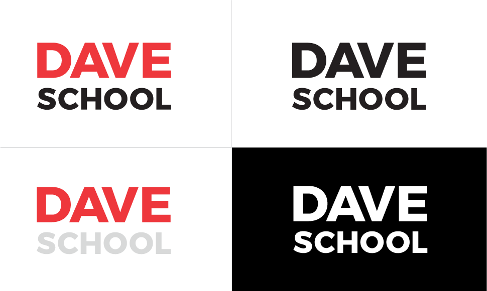
Create a modern flat identity that would stand the test of time. Utilize type face that is both classic and modern at the same time.
Thoughts and words that represent the brand and DAVE School
Team, collaborative, warm, inviting, results driven, movies, games, friendly, inside Universal Studios, creative, artistic, DAVE pride, animate, original, small and unique, Orlando, Florida, multi-talented

FIRST ATTEMPT
EXPLORING THE USE OF A LOGO SYSTEM
Instead of having a singular static mark, a logo system acts as a 'graphical framework'
that can shift and change for different situations, allowing brands to start a conversation
beyond it's own name, pointing to other ideas and issues that are important to them on
any chosen day.
Even when big changes are made, due to the simplicity of the underlying framework it
remains very recognizable.
PROCESS
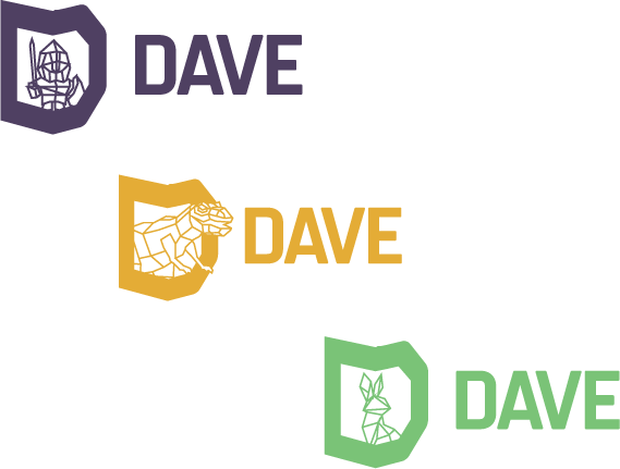


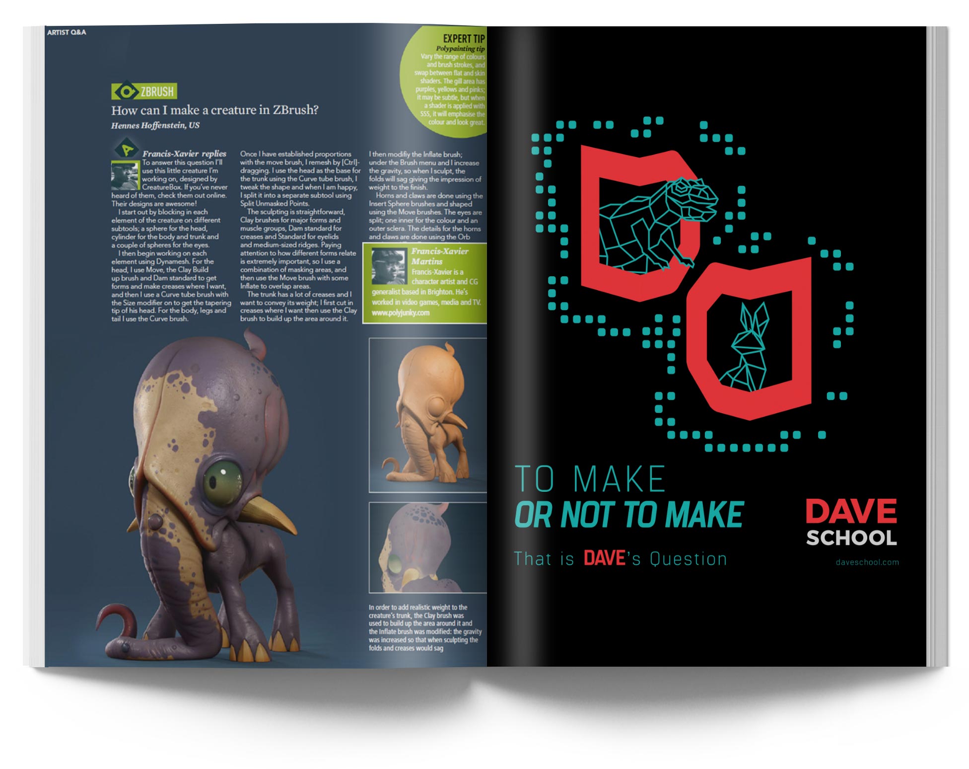
The idea behind using a logo system for DAVE School was to primarily showcase the full breadth of 3D art that one can create in a 2D graphically simplified manner. There could be infinite wireframe low poly recognizable characters inside the ‘D’ icon to show the variety of 3D art possibilities.
By use of different playful colors that will appeal to the Generation ‘Z’ and millennial demographic while staying on-brand at the same time.
The different bold choice of colors would also be great to differentiate DAVE against other competitor schools since no other schools are using this identity brand strategy.
Not to mention cool for mixing up Ad campaigns that might otherwise get boring.
And just imagine if those little wireframe dudes being animated for shareable GIFS and possibly a new slick logo animation.
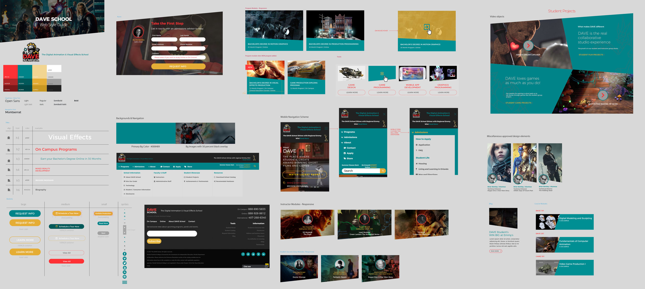
UX & WEB DEVELOPMENT
I have spent the last 10+ years working for private post secondary art schools and colleges. I have created websites and landing pages that use modern UX standards and apply branding as needed.


UX USER FLOW / INFO ARCHITECTURE


I setup a style guide so that future design team members could quickly and efficiently make changes and addition to the website.
STYLE GUIDE

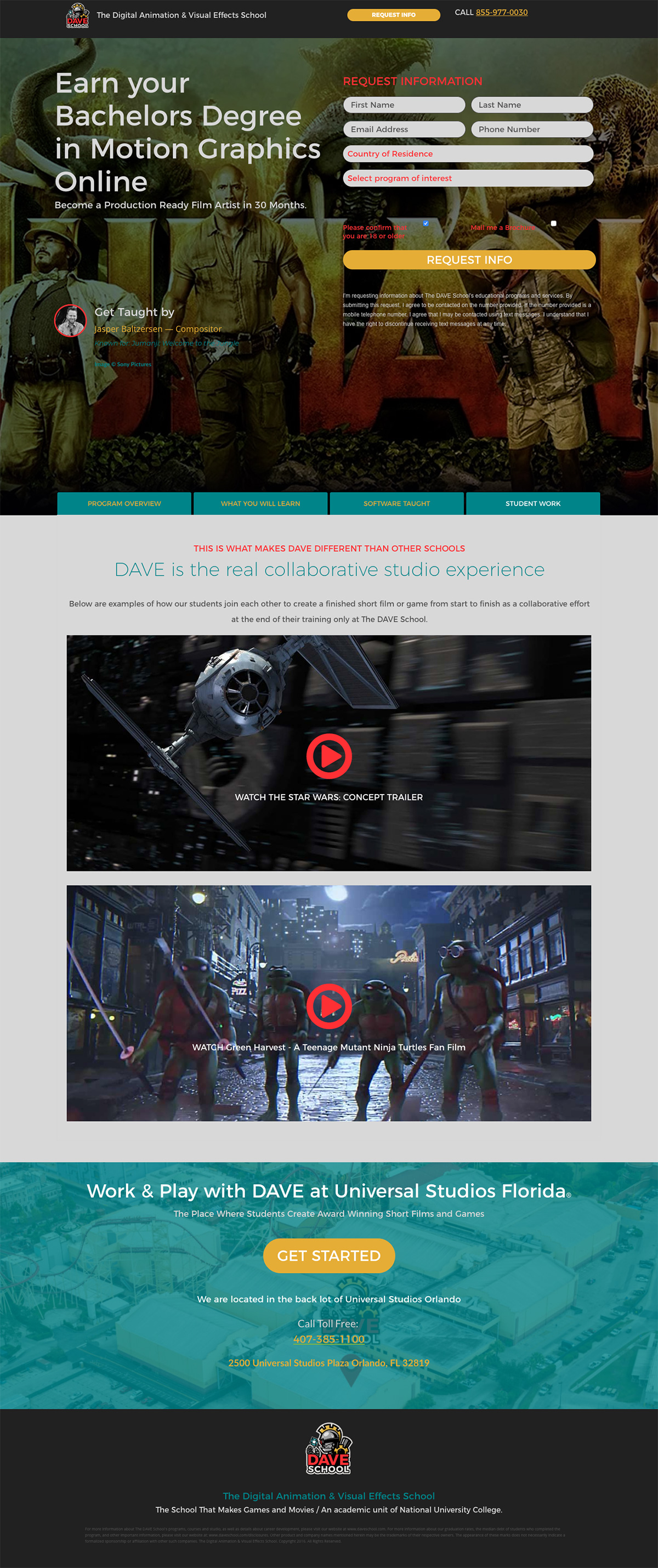
LANDING PAGES
I designed a series of landing pages for the digital marketing agency to link paid search and social ads to.
GOALS
Increase lead capture
Setup persona specific funnels
Boost engagement on social
Content marketing of unique 3D assets


BANNERS
Corresponding display ads were designed for each campaign to optimize CTRs for social and remarketing efforts.


NEXT PROJECT
YOFIMA