

PROJECT
BIKER GEAR CLUB
MY ROLE
FOUNDED
BRAND IDENTITY
CREATIVE DIRECTION
PACKAGE DESIGN
PRODUCT STRATEGY
CONTENT CREATION
WEB & DIGITAL DESIGN
UX/UI DESIGN
DIGITAL MARKETING
SOCIAL MEDIA
PHOTOGRAPHY
MERCHANDISING
SUMMARY
Building a Subscription Box for Motorcyclists

PROBLEM STATEMENT
Every retail demographic had a subscription box service…’beauty’, ‘little kids’,’bookworms’, ‘preppers’, ‘sports fans’ even DOGS have their own subbox!
So…
I not only founded and built the company from the ground up from a single box. I also used my design skills to handle the following. I guess you could say my entrepreneur and passion for motorcycles within became unleashed.
In late 2016 I decided it was time help bring the motorcycle industry into the subscription economy that had taken hold in so many other retail sectors. This is where the root of Biker Gear Club was planted.
Why? Because I have been a motorcyclist most of my life and I wanted to not only share my passion for the sport through sharing brands I care about with the rest of the motorcycle community. I also decided it was time to give gift buyers a chance to buy a gift that their fellow loved one would actually use.
BRANDING
On a conceptual level the core identity of Biker Gear Club was designed primarily to speak to the motorcycle community. The moto community is made up of several different types of riders. ie: sport riders, Harley fans, motocross and dirt bike riders and finally the vintage custom cafe racer builder types. The interesting challenge this brought was that not all 'types' of bikers are necessarily into the same design aesthetics.
Anatomy
Primary lockup
Wordmark
Secondary lockup
Icon design
Something timeless that is inspired by the infinity symbol to represent the recurring subscription business model. While at the same time breaking the infinity symbol into two parts; the helmet, and the wheel. Creating the somewhat abstract silhouette of a motorcycle.


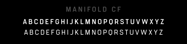
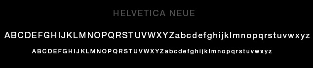
TYPOGRAPHY
The typography had to be simple and clean yet strong, unified, and articulate. I chose a utilitarian typeface inspired by the precision of a computer terminal, then tempered and softened with a hint of warmth.
Head
Body
PACKAGING
It all started with a box...
Premium quality is the bedrock upon which the brand formed. From the quality of the experience opening one of our boxes to the quality and feel of the box itself.


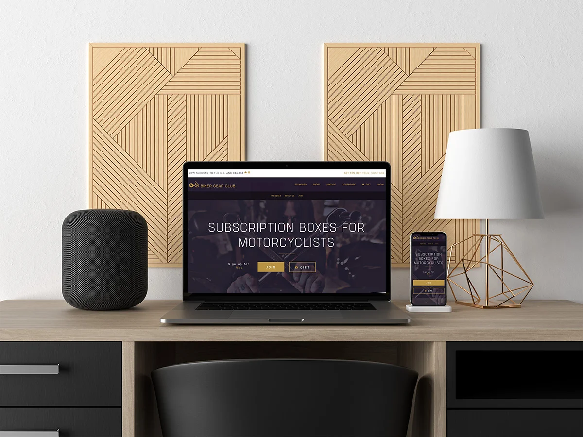
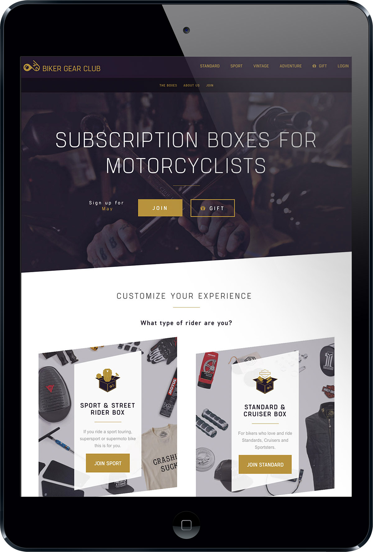
WEBSITE
The motorcycle industry is full of e-commerce websites that can really make a mess for the user experience. My hope with the Biker Gear Club website was to create a great and impactful user experience. To set it a part from the crowd of outdated moto related websites and bring it to the modern age of web design. Using a minimal approach to teach the user about the product and guide them quickly and efficiently through the customer conversion on-boarding process.


VIDEO CONTENT
Building a brand from scratch requires skill and dedication to various creative disciplines. I am not afraid to take on any of them. These videos were scripted, directed, edited by me.
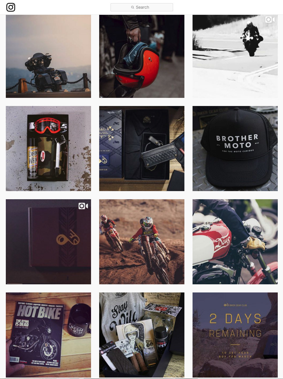
INSTAGRAM CONTENT

NEXT PROJECT
DAVE SCHOOL